Prism Case Study

Prism Mobile
My Role: Solo UI UX Designer
Date: May 2018 - December 2018
Methods: User interviews, competitive analysis, SMEs interviews, field tests, wireframes, mockups
Tools: MyBalsamiq, Adobe XD
Team: Jr and SR developer, Product Manager, SME, UX Designer
Impact: 100+ downloads on the Google Play Store and Apple App Store. Trusted and used by US Army, and more
Project Context
As many industries aim to integrate technology more and more we aimed to solve this for field working foresters, known as ‘Cruisers’. Our team looked to develop a product that helped the modern day forester collect data, navigate, and report in a modern way, using a tablet.
We partnered with a subject matter expert (SME) to help us gather information about how cruisers do their job today and what we can do to help. After engaging with users, SMEs, and the product owner we found that what our user wanted was A faster, more efficient and less error prone way to enter data and get it bag to HQ. With our north start yet we went on the journey to answer this question and produce an app that would solve the users problems.
Process
HCD and Agile
As a solo designer I followed the User Centered Design process to investigate how cruisers currently do their job and how they want to do their job. Letting user research be our guide, we brainstormed many solutions to the issues at hand, then we tested our ideas with high-fidelity interactive prototypes (Adobe XD) in office and in field.

Discovery
Competitive Analysis: Similar products already existed
Our research started off with an interview with our SME in Montreal, Quebec, Canada identifying what could make our product different from the current competitors in the space. After interviewing the SME we discovered there were three major players in the space already; TwoDog Software a small software firm making forestry specific software, Trimble a monster in the GIS and technology space.
Where we could take advantage
F & W TwoDog; only available on Windows. We could take advantage of cross platform development with Xamarin.
Trimble; the major player in the market, doing a lot right already, but we decided being a smaller agile shop now with a UI UX Designer (me) we could iterate faster and design closer to the end user.
3Log; being the industry standard we aimed to be that 1% better, once again they were only offering a Windows deployment, not allowing users to use devices that they were familiar with and want to carry with them (iPads)


User Interviews and field testing
Staying close to our users was top of mind during this whole process, since our team was made of software developers, a business analysis, and a designer we needed to leverage all we could from our end user to guide to the correct answers. During user interviews we probed with questions like; “What are all the elements you need to use this in?”, “what is the worst part of the work flow you use currently?”, etc. What came out of these sessions was that the cruisers needed a product that was easy to use while cutting through bush, hurdling large fallen trees, and an app that was easy to see under a dark tree canopy but also in broad daylight. After the user interview sessions we synthesised the research and dug deep to create a interactive prototype we could send to them to use in the field.
After we locked in the first 2 iterations of the live prototype it was time to hand off and let the development team do what they do best, develop. In a short 4 months the developers got a beta stood up and we jet set off from Calgary, Alberta, Canada to sun, humidity, and hot Bainbridge, Georgia, USA where we wanted to do an in person user study, which included swapping my Nike Vapormax sneakers and Winnipeg Jets ball cap for steel toe boots and a hard hat. From these sessions we learnt a lot about how hard it is to navigate under the tree canopy due to low light conditions and bouncing GPS among countless other lessons we took these learnings home and began another design cycle to solve for the issues that went over our head the first time.
Design Requirements
Foresters don’t like tech, but they want to use it
Make it simple
Foresters don’t want to be head down tapping all the time, they want “the least number of taps”. If this app wasn’t simple, efficient, and fast foresters were less likely to use it and even switch back to pen and paper … yes pen and paper.
Make it smart
To ensure simplicity and use we needed to make sure it gave the cruise the information they needed then and their, from heads up displays of how to navigate to their plots, to easy data entry.
Keep it fair
If HQ got to see stats of the cruisers like productive time, and trees collected we needed to make sure the cruisers themselves were able to harness this information to their benefit.
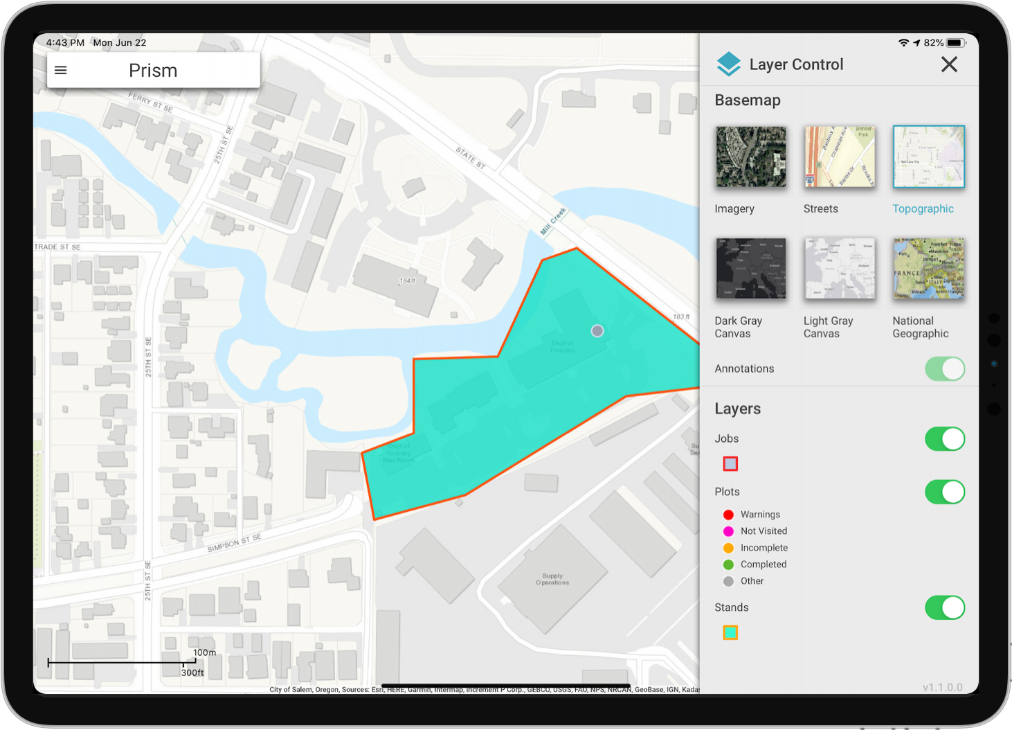
Showcase
Pixel-perfect and Developer Handoff
Being a small team we knew that we had to iterate fast and that the hand off from design to dev hand to be flawless, after we locked down our ideas with wireframes and interactive prototypes, it was time for the fun part, pixel perfect design. Work with a new Jr developer and a Lead developer that had not worked with a UI UX Designer previously, I knew I had to push myself to lock down each pixel. We used Adobe XD’s built in sharing platform to handoff mock ups, this was the perfect tool because our lead dev was based in Ottawa, Ontario, Canada while the other developer was sitting across the desk from me. We knew we had to keep interaction and communication high during the development phase so we utilized the built in comments section in XD and had weekly design checks-ins with the devs to make sure everything was making sense and nothing was being missed.


Reflections
This was not only my first large project with the company but it was for the Jr developer as well, this lead to great comradery and culture building as we could bond over our similar new experiences. With the good came bad as well in hindsight creating a design system or even design patterns for the mobile applications our company was starting to develop was not top of mind, so each and every component was create when needed, which meant losing valuable time. This lesson led to me having a conversation with my director about how we needed to implement a design system (case study coming soon) to allow for myself as the only designer in the company to iterate faster and be more available for the developers. I gained a holistic view of how a mobile product comes to life and how you need to be able to think about what you will bring forward from each project into the next.
This was also the first time for me to drive internal and external communication. I was in charge of stakeholder management; showing new wireframes and mockups and facilitating stakeholder engagement. Internally I was held responsible for scrum master duties; running the agile/scrum workflow of development. I learned how to effectively communicate with internal and external stakeholders communicating not only my rationale but also the teams rationale in the decisions we were making.